Are Manual Cars More Gas Efficient?
A look into the tidyverse cars dataset.

For my first ever blog post, I thought I would start off with a simple question using a simple dataset. When I turned 16, I did what every 16 year-old in America does and immediately got behind the wheel of a car. Unlike most teenagers, the first car I got to drive had a weird third pedal and was hard to get moving. It was a manual. For the record, I still have nightmares about trying to start my old car on a steep hill.
In the United States, manual cars are have definitely fallen out of fashion. Back in 2010, almost none of my other friends drove a manual. Whenever I gave people rides they were always surprised and would always ask, “Why do you not just drive an automatic?” My response was always the same, “Manual cars get better gas mileage.” Honestly, I have no idea if that’s true even in the slightest. So, I am going to try to answer that question.
Do manual cars get better gas mileage?
First thing to do is load in the data set. I said I was going to use a simple dataset and I meant it. I am using the mpg data that is preloaded with tidyverse.
library(tidyverse)
library(viridis)
mpg <- mpg
#image from # https://www.topspeed.com/cars/why-is-the-manual-transmission-living-on-borrowed-time-ar182081.html
Boom. That was easy.
What does this data look like? (Luckily this data is already pretty cleaned up, so I don’t have to worry about that)
knitr::kable(head(mpg), "pandoc")| manufacturer | model | displ | year | cyl | trans | drv | cty | hwy | fl | class |
|---|---|---|---|---|---|---|---|---|---|---|
| audi | a4 | 1.8 | 1999 | 4 | auto(l5) | f | 18 | 29 | p | compact |
| audi | a4 | 1.8 | 1999 | 4 | manual(m5) | f | 21 | 29 | p | compact |
| audi | a4 | 2.0 | 2008 | 4 | manual(m6) | f | 20 | 31 | p | compact |
| audi | a4 | 2.0 | 2008 | 4 | auto(av) | f | 21 | 30 | p | compact |
| audi | a4 | 2.8 | 1999 | 6 | auto(l5) | f | 16 | 26 | p | compact |
| audi | a4 | 2.8 | 1999 | 6 | manual(m5) | f | 18 | 26 | p | compact |
Cool. So, we have transmission (trans) and city (cty) and highway (hwy) gas mileage in miles per gallon. There are a few other columns that im not going to worry about right now. You can learn what all the columns mean exactly by using the command “?mpg”.
First thing first, what is the average gas mileage across all automatic and manual transmission cars?
# The trans column has a lot of different transmissions of automatic and manual transmissions, so I am going to simplify it first.
mpg <- mpg %>%
mutate(transmission = case_when(str_detect(trans, pattern = 'auto') ~ 'automatic', TRUE ~ 'manual'))
# making a boxplot
ggplot(mpg, aes(x= transmission, y= hwy))+
geom_boxplot()+
theme_bw(base_size = 16)+
xlab('')+
ylab("Highway gas mileage")+
ggtitle("Highway gas mileage and transmission type", subtitle = "A simple boxplot")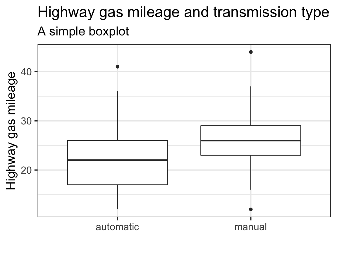 Just looking at this quick box plot it does look like manual cars on average get better highway gas mileage! It looks like there are some outliers, so let’s check out the distribution of the points as well.
# making a violin plot with a dotplot
ggplot(mpg, aes(x= transmission, y= hwy))+
geom_violin(aes(fill = transmission), width=.8) +
geom_boxplot(width=0.1, alpha = .2)+
geom_dotplot(binaxis='y', stackdir= "center" , dotsize=.4, position=position_dodge(.5))+
theme_bw(base_size = 16)+
theme(legend.position = "none")+
xlab('')+
ylab("Highway gas mileage")+
scale_fill_viridis(discrete = TRUE, alpha = .8)+ # Adding some color
ggtitle("Another look at gas mileage and transmission type", subtitle = "A violin plot, a boxplot, and a dotplot overlayed")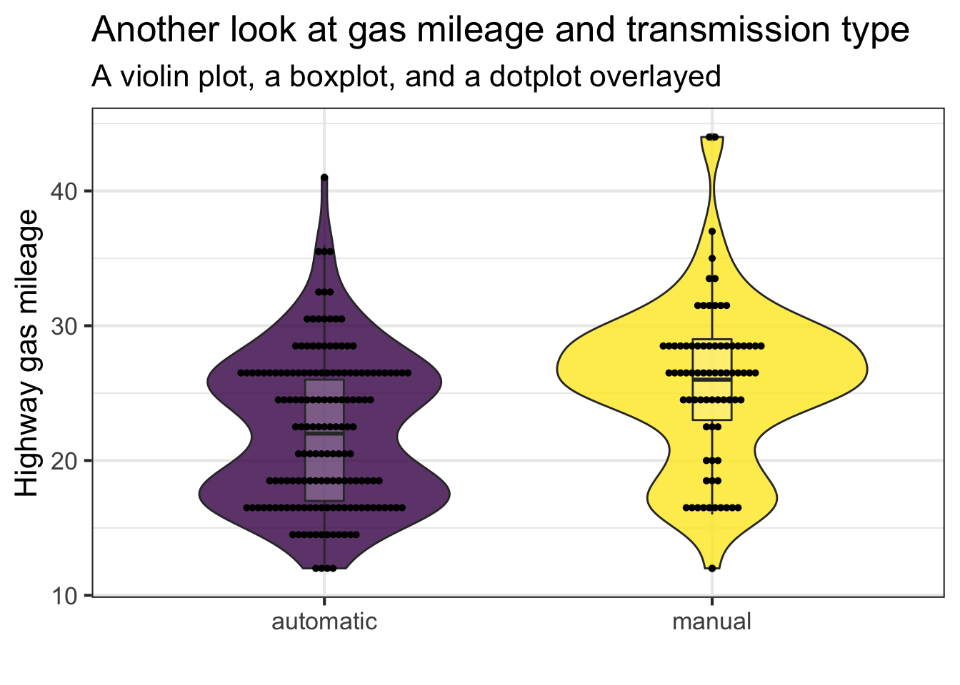 The data is a little bimodal, which is interesting. It looks like on average manual cars are definitely more efficient on the highway. Also, the car with the best highway gas mileage is a manual car!
Let’s see if we can see why there is a bimodal distribution.
# Creating a violin plot with colored points by cylinder number. Had to switch to geom_point because geom_dotplot overlaps points of different groups.
ggplot(mpg, aes(x= transmission, y= hwy))+
  geom_violin(width=.8) +
  geom_boxplot(width=0.1, alpha = .2)+
  geom_point(aes(color= as.character(cyl)), size = 3, position = position_dodge(width = .25))+
  theme_bw(base_size = 16)+
  xlab('')+
  ylab("Highway gas mileage")+
  labs(color = "cylinders")+
  scale_color_viridis( discrete = TRUE,alpha = .65)+
  ggtitle("Do number of cylinders effect gas mileage?")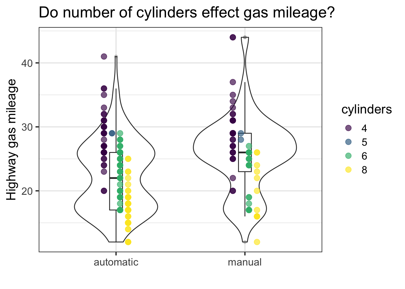
It looks like the bimodality is due to different sizes of motors. I’m sure the engine displacement (dipl) also plays into gas efficiency. Bigger motor = more vroom vroom = more gas. Makes sense.
Let’s take one more look at engine size and its effects on gas mileage.
# making a scatter plot with a line of best fit applied
ggplot(mpg, aes(x= displ, y = hwy, color = transmission))+
  geom_point(position = "jitter")+
  geom_smooth(se = FALSE)+
  theme_bw()+
  xlab("Engine displacement (litres)")+
  ylab("Highway gas mileage")+
  scale_color_viridis( discrete = TRUE)+
  ggtitle("Highway gas mileage vs engine size")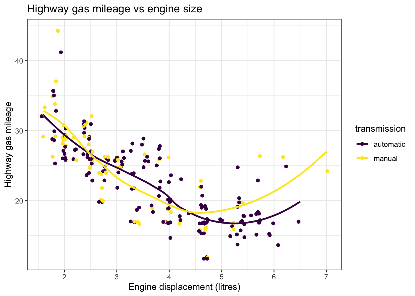
The manual cars with large engines get a lot better gas mileage than automatic cars with large engines. I wasn’t exactly expecting that. However, there are also not nearly enough data points of manual cars with larger engines to make this call for certain.
When we control for make, model, and engine size do the manual versions get better gas mileage? While, I was scanning this data set I saw that there was some data that had the same make and model cars, but with different transmissions.
# My goal here is to get groups of the same cars with the only thing being different is the transmission and directly compare gas mileage. I used add_tally() to see which car transmissions had two pairs (aka two transmision transmissions) and filtered everything that had less. There might be an easier way to do this, but this is how i thought about it.
mpg_cars <- mpg %>%
group_by(manufacturer, model, year, cyl, displ, fl) %>%
add_tally()%>%
filter(n>1)%>%
mutate(car = paste(manufacturer, model, year, cyl, displ, fl))%>%
ungroup() %>%
select(car, transmission, hwy) %>%
distinct() %>%
group_by(car) %>%
add_tally() %>%
filter(n > 1) %>%
ungroup() %>%
mutate(car = fct_reorder(car, hwy)) %>%
filter( car != "dodge caravan 2wd 1999 6 3.8 r") # I only wanted paired manual and automatics cars and this guy was bein tricky so I just removed dodge caravans.
ggplot(head(mpg_cars, 40), aes(x = car, y = hwy, fill = transmission))+
geom_col( position = "dodge")+ # The default for geom_col is position = "stacked"
coord_flip()+
xlab('')+
ylab('Highway gas mileage')+
scale_fill_viridis( discrete = TRUE, alpha = .95)+
theme_minimal()+
ggtitle("Gas mileage broken down by make and model", subtitle = "Comparing transmission type")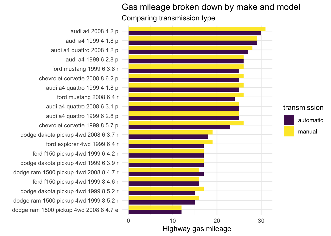 It appears that manual cars usually get slightly better gas mileage than the automatic versions of the car. This isn’t always true and the two versions have the same gas mileage sometimes. There are also a few cases where the automatic car get better gas mileage! In conclusion, manual cars get slightly better gas mileage when comparing automatic vs manual transmissions in the same make and model.
There are still a lot of unanswered questions that I wasn’t able to address. A big one I wanted to look at was the change over time of gas efficiency in cars; however, this data set only has two time points, 1999 and 2008, so that wasn’t feasible. I looked online and clearly, as technology improves, so does gas efficiency. In addition, in the past 5 years automatic cars have gotten more efficient and have started to surpass manual cars in gas mileage. Apparently, this is also dependent on the way someone drives. Somone with a heavy foot gets worse gas mileage. It would be really cool if we had a dataset that could examine driver tendencies and gas mileage! In conslusion, using the preloaded tidyverse cars dataset manual cars often get slightly better gas mileage.
Share this post
Twitter
Google+
Facebook
Reddit
LinkedIn
StumbleUpon
Pinterest
Email